Add a MediaGallerySection
You can add a gallery of media items to your page. This is a great way to showcase your content.
LightNet provides a MediaGallerySection component that displays a grid of media items or a carousel when configured.
Here is an example on how to use it:
---import { Page, MediaGallerySection } from "lightnet/components"import { getMediaItems } from "lightnet/content"
const someEnglishBooks = await getMediaItems({ where: { type: "book", language: "en" }, orderBy: "dateCreated", limit: 10})
const { t } = Astro.locals.i18n---
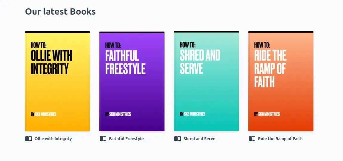
<Page> <MediaGallerySection title={t("x.english-books.title")} items={someEnglishBooks} layout="book" viewLayout="carousel" /></Page>Inside the frontmatter the someEnglishBooks variable is prepared using LightNet’s getMediaItems function.
By default the MediaGallerySection component displays them in a grid and shows the title and image of each media item.
Set viewLayout="carousel" to render the items in a horizontal carousel.
The number of grid columns depends on the screen width.
Pass your media items to the items property. Also choose a layout to define the appearance of the gallery.
Reference
Section titled “Reference”The MediaGallerySection component extends the functionality of the Section Component.
This means you can use props supported by Section, in addition to the ones listed here. The Section’s maxWidth
option is not yet supported. MediaGallerySection only implements maxWidth=wide.
type: MediaItem[]
example: const books = await getMediaItems({/*...*/})
required: true
The array of media items to display.
layout
Section titled “layout”type: "book" | "video" | "portrait" | "landscape"
example: "book"
required: true
The layout of the gallery. The layout is used to determine the number of columns and to style the cover images. Available layouts are:
portrait: Takes 2 to 5 columns. Use this for cover images that are portrait oriented.book: Takes 2 to 5 columns. This equals toportraitlayout. Additionally a book fold is added to the cover image and corners are less rounded.landscape: Takes 1 to 4 columns. Use this for cover images that are landscape oriented.video: Takes 1 to 4 columns. This equals tolandscapelayout. Additionally all cover images have an aspect ratio of 16:9.
viewLayout
Section titled “viewLayout”type: "grid" | "carousel"
example: "carousel"
required: false
default: "grid"
Controls the overall arrangement of items. The default "grid" displays items in a responsive grid.
Set to "carousel" to render items in a horizontally scrollable carousel.